Portland Opera
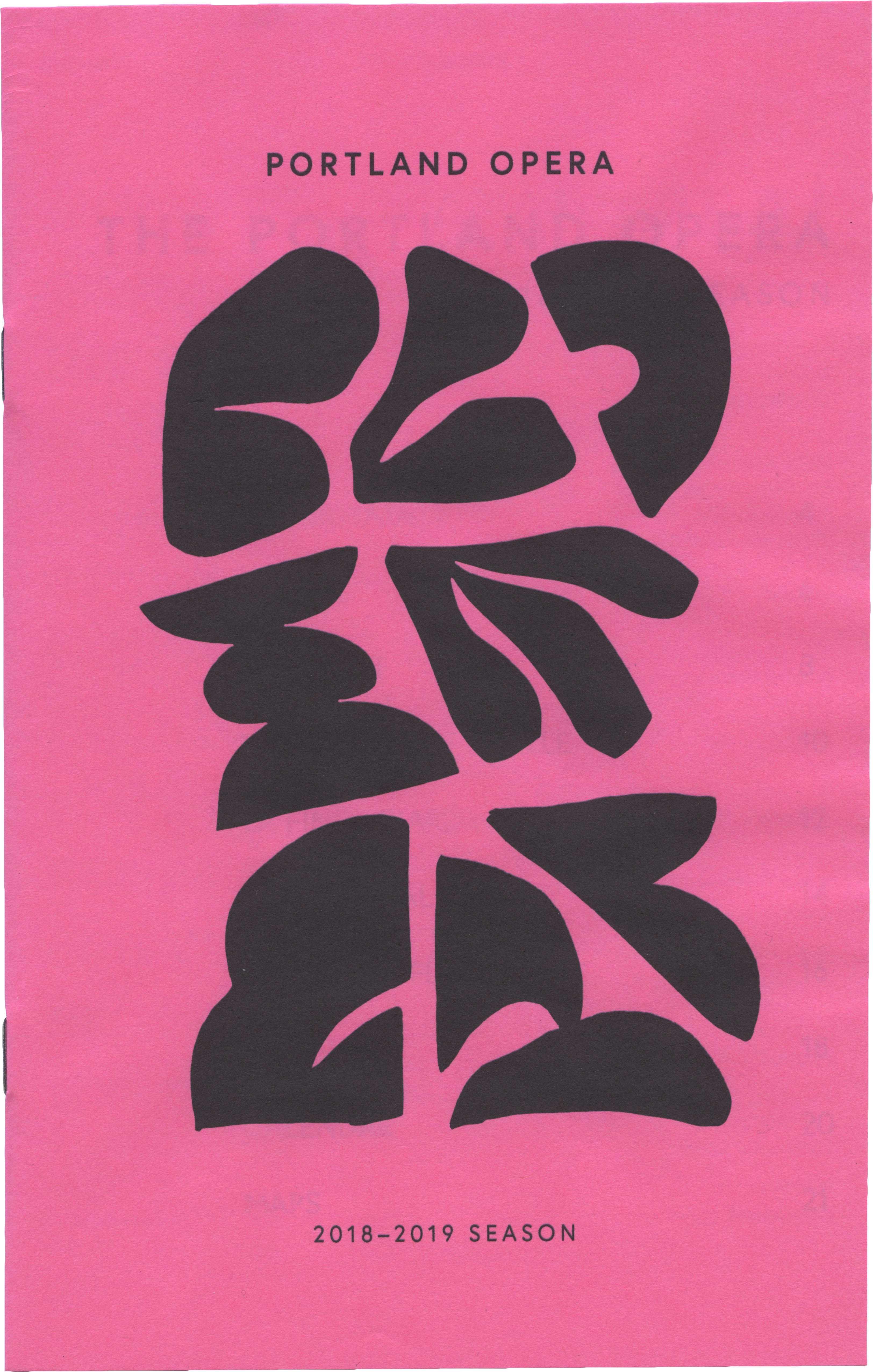
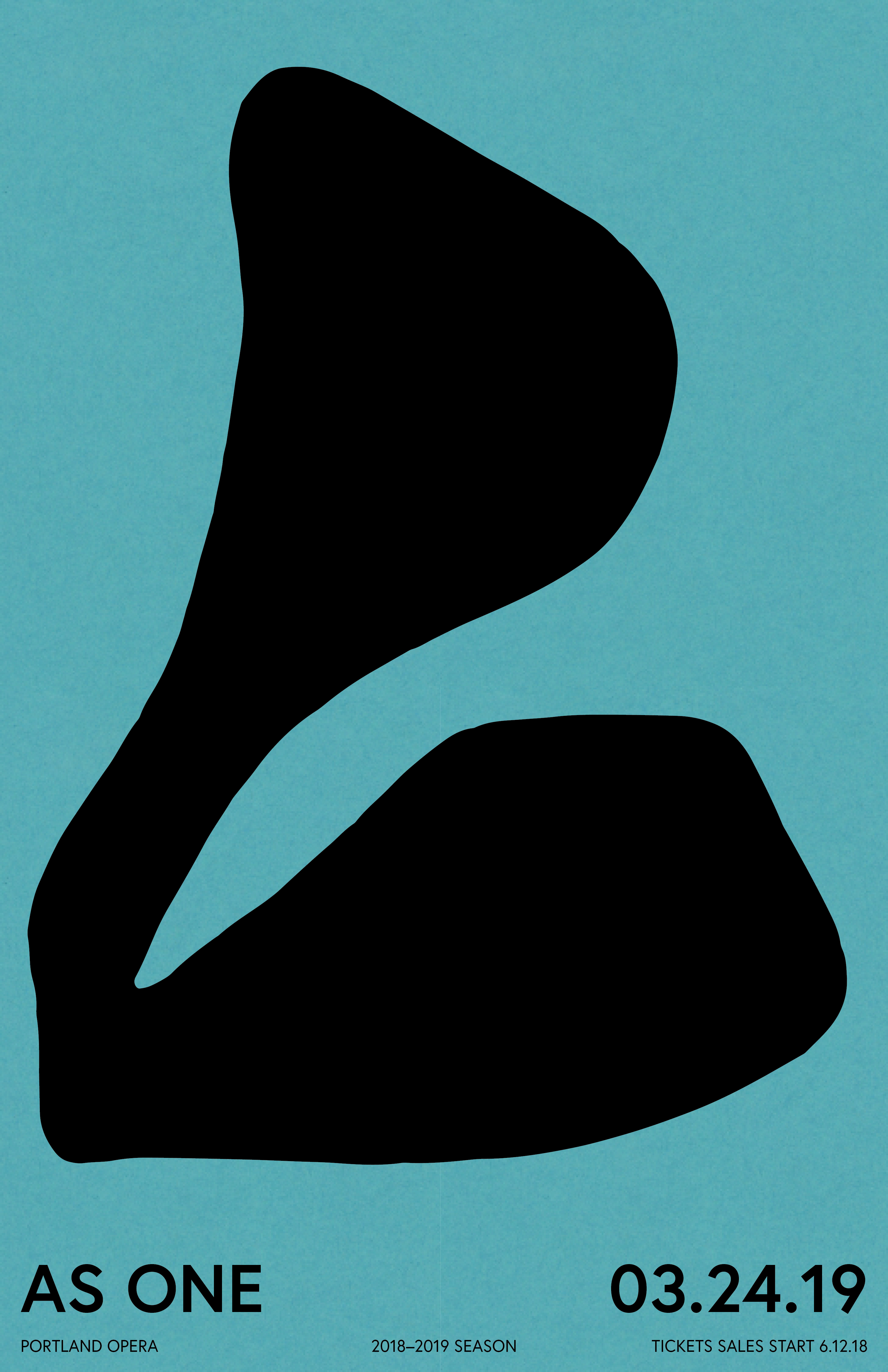
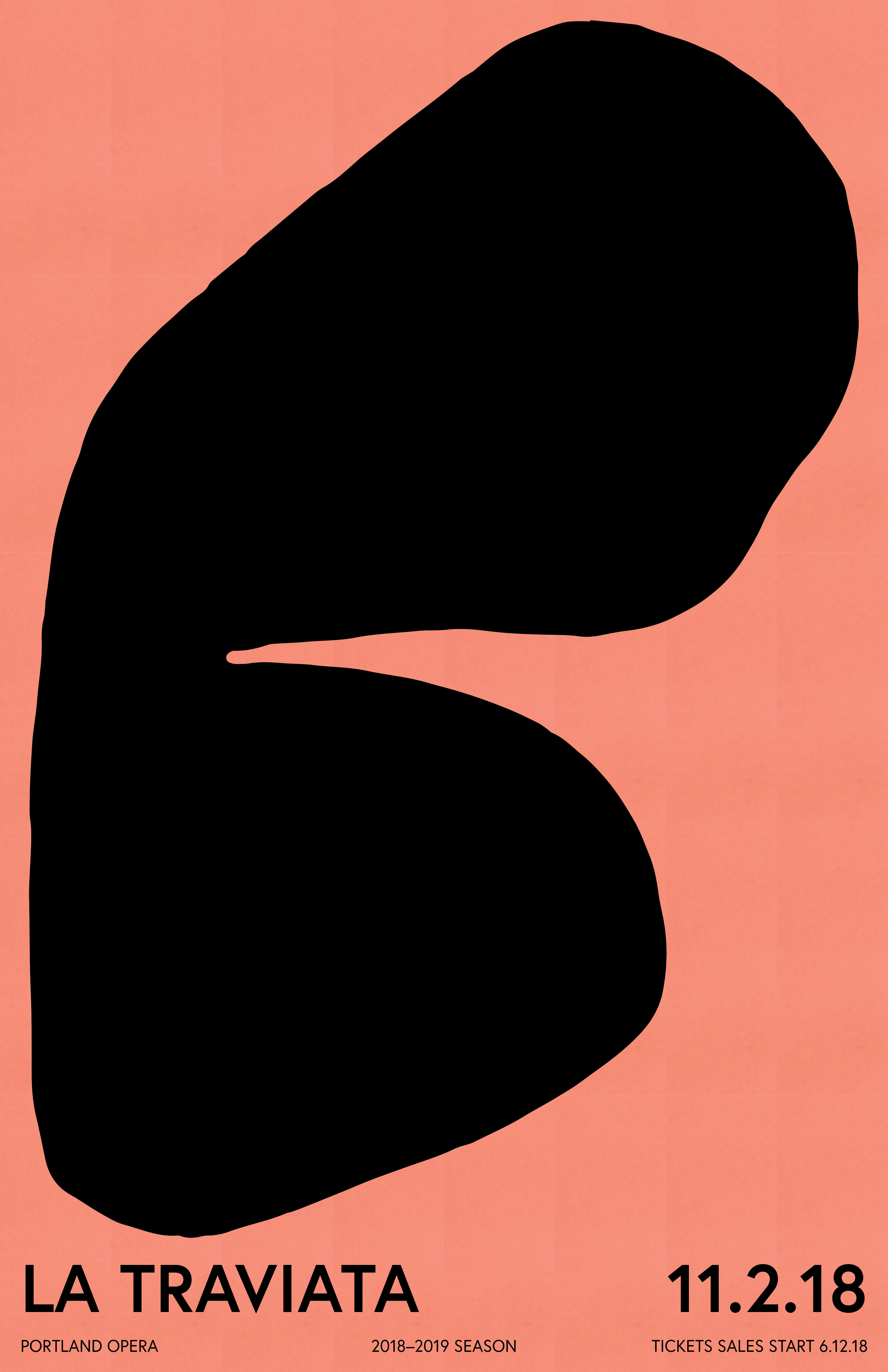
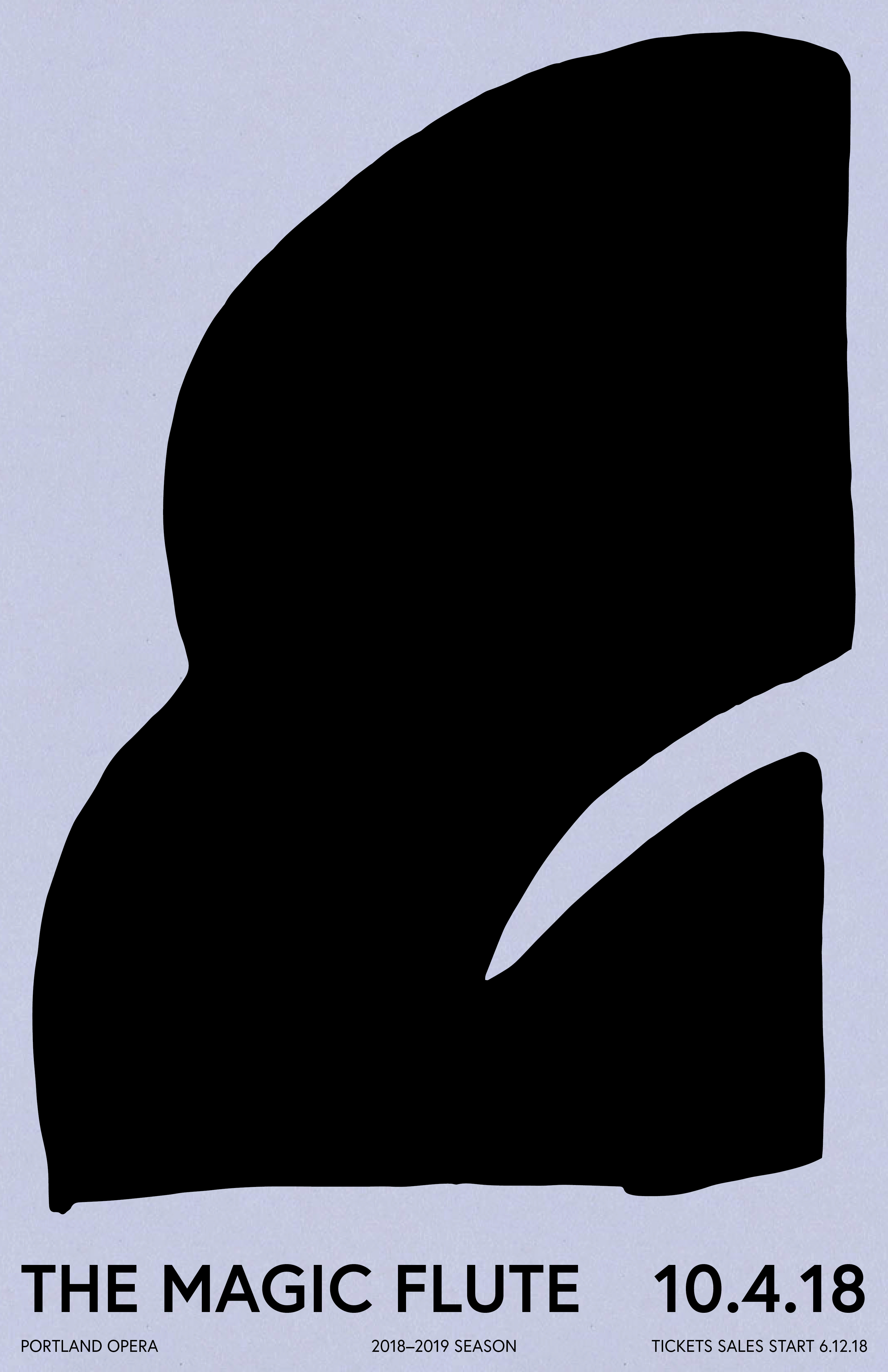
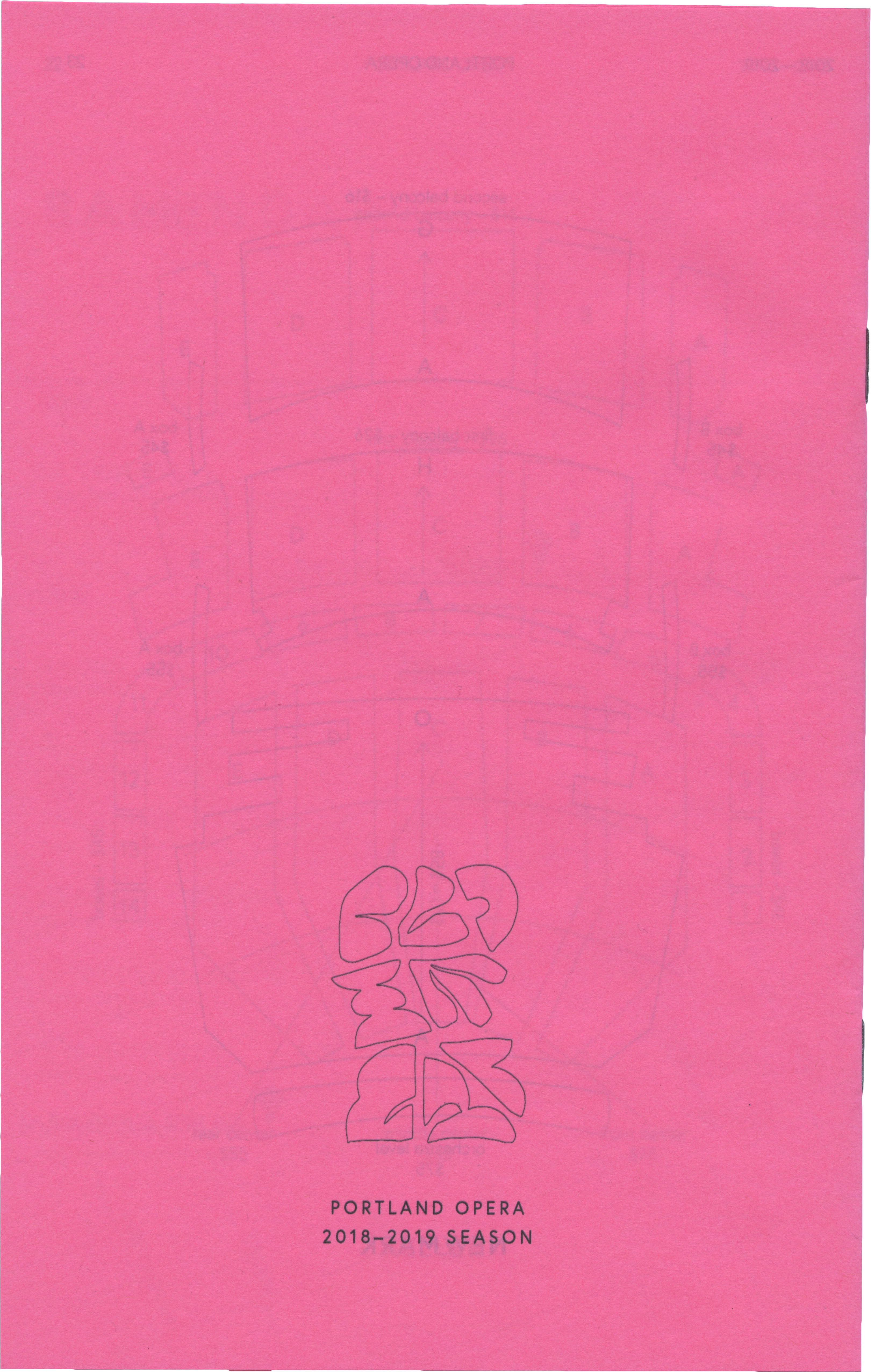
A new system of branding for the Portland Opera. Each show of the 2018/2019 season will be represented by a new form, an organic shape. Together, the shapes create a larger picture, a motif of organic bodies that represent movement and livelihood.
The choice of pink printer paper was a way to make the small booklet pop, to attract a younger audience that the opera currently hasn’t attracted.
The shapes would be advertised all over Portland through a series of posters. People could identify these shapes with the associated show, and create a memory.
_____________ posters ____________
![]()